【前端笔记】css实现多元素中心旋转
何故扰人清梦 2024-06-19 10:33:02 阅读 70
css实现多元素中心旋转
一、实现思路二、GIF预览三、实现代码1.html代码2.css代码
一、实现思路
1、先把元素定位到想旋转的位置(中心点)2、确定旋转的方向(顺/逆时针)3、偏移一定距离后(半径)4、最后让元素反方向自转(实现元素文字始终为正向)5、鼠标悬浮动画暂停(可选)
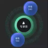
二、GIF预览
三、实现代码
1.html代码
代码如下(示例):
<div className="MainBox "> <div className='Provincial items'>省级</div> <div className='Municipal items'>市级</div></div>
2.css代码
代码如下(示例):
.MainBox{ width: 220px; height: 220px;position: relative;.items { width: 70px; height: 70px; position: absolute;top: 75px;left: 75px;.Provincial { animation: action 10s linear infinite;}.Municipal { animation: action1 10s linear infinite;}}}// 悬浮后暂停.MainBox:hover { div { animation-play-state: paused;}} // 旋转动画@keyframes action { from { transform: rotate(0deg) translate(78px) rotate(0deg);}to { transform: rotate(360deg) translate(78px) rotate(-360deg);}}@keyframes action1 { 0% { transform: rotate(180deg) translate(78px) rotate(-180deg);}100% { transform: rotate(540deg) translate(78px) rotate(-540deg);}}
声明
本文内容仅代表作者观点,或转载于其他网站,本站不以此文作为商业用途
如有涉及侵权,请联系本站进行删除
转载本站原创文章,请注明来源及作者。